Stairtek Brand Identity and logo refresh
Stairtek approached me to refresh their existing logo and develop a cohesive branding package that better reflected the quality and professionalism of the company.
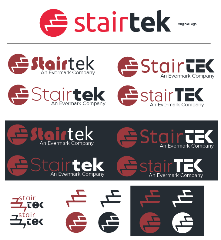
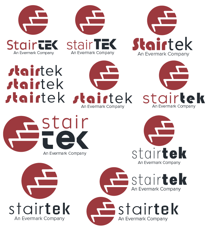
The original identity featured uneven, jagged line work when resized and an overly vibrant color palette, which made the logo feel visually inconsistent and difficult to apply across different brand materials. I cleaned up the logo and refined the shapes to make the mark feel more balanced and intentional. I also toned down the color palette and created a more cohesive visual system that could work across different applications. I developed a cohesive visual identity package to give Stairtek a more consistent brand presence across applications.
Client
Stairtek
Year
2026
Original logo:
Concepts: